


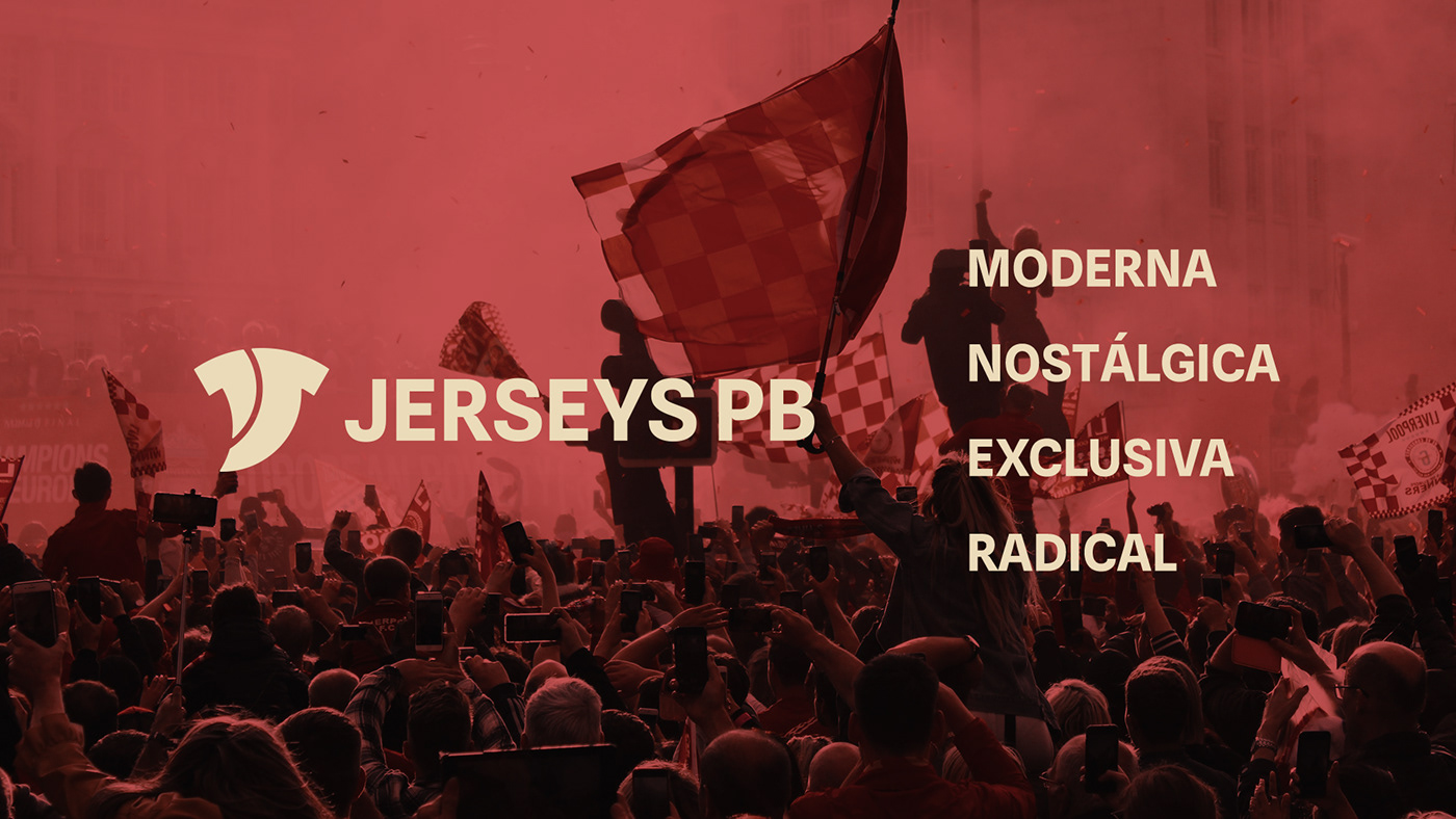
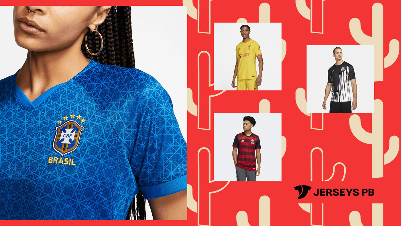
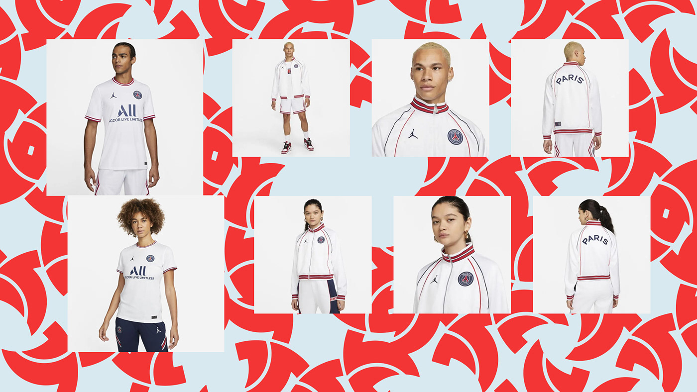
Sobre a marca
A Jerseys PB é uma loja de material esportivo que tem como missão tornar os torcedores mais próximos dos seus times através das camisas que vestem.
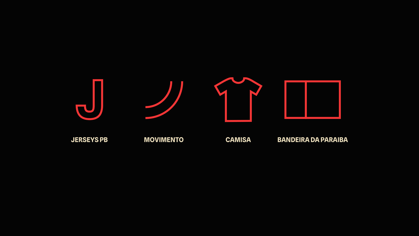
O nome Jerseys PB vem da junção entre a palavra inglesa utilizada para se referir especificamente às camisas de clubes esportivos, que é o foco da marca e a sigla do estado de origem da empresa, a Paraíba.
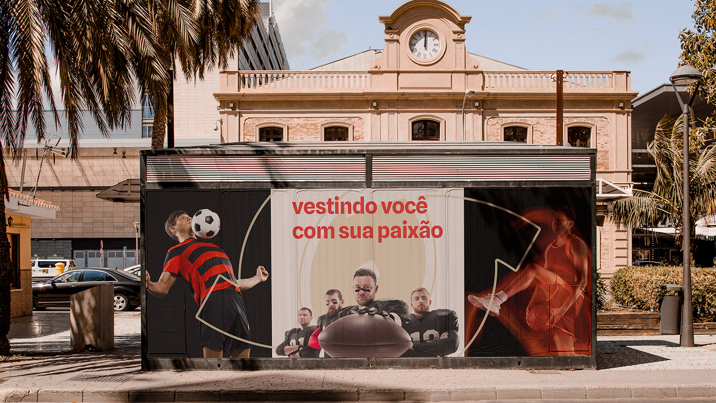
Mais do que apenas vender camisas, sabemos que estamos lidando com as paixões de cada torcedor/cliente e por isso queremos levar a melhor experiência de compra possível a fim de fazer o cliente se vestir com a sua paixão.
Nós amamos o esporte assim como os nossos clientes e isso torna a conexão entre a loja e os consumidores algo único.
About the brand
Jerseys PB is a sporting goods store whose mission is to make fans closer to their teams through the shirts they wear.
The name Jerseys PB comes from the junction between the English word used to refer specifically to sports club shirts, which is the focus of the brand, and the acronym of the company's home state, Paraíba.
More than just selling shirts, we know that we are dealing with the passions of each fan/customer and that's why we want to bring the best shopping experience possible in order to make the customer dress with their passion.
We love the sport as well as our customers and this makes the connection between the store and the consumers something unique.


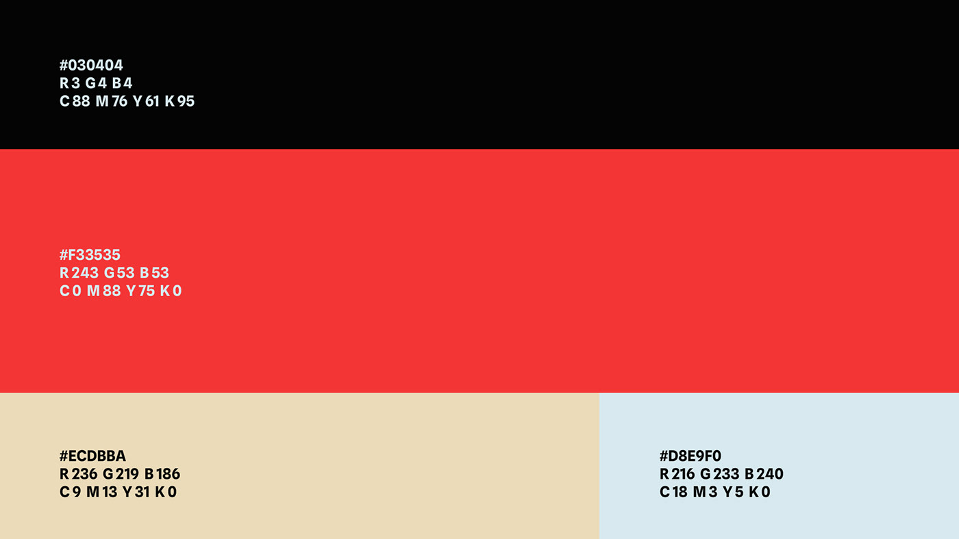
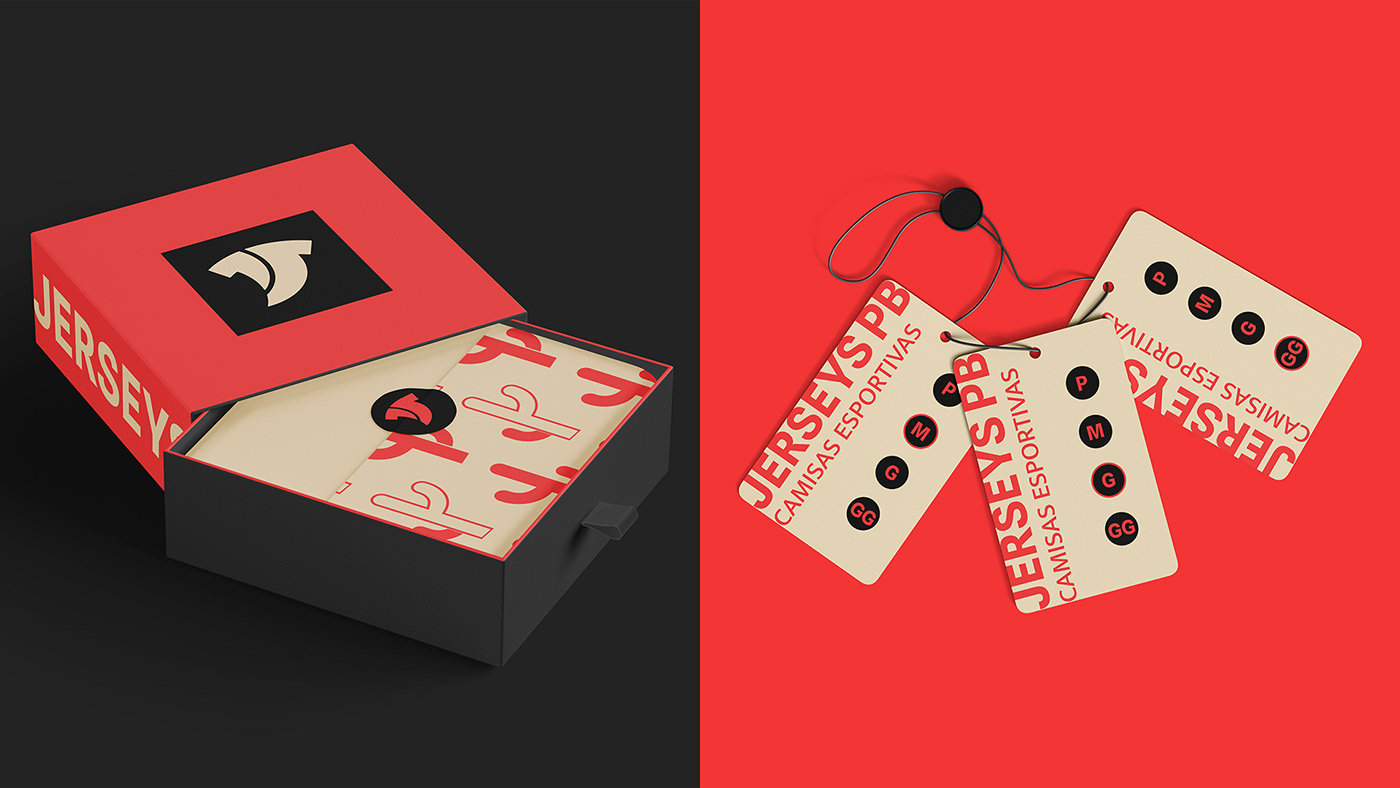
Paleta de cores
A paleta de cores foi estudada e desenvolvida selecionando como cores principais as que se assemelham as utilizadas na bandeira da Paraíba, estado que da origem ao nome da empresa.
Como elementos secundários foram escolhidos tons neutros que contrastassem de forma harmônica com as cores principais da paleta trazendo assim as sensações de modernidade, exclusividade e sofisticação.
Color palette
The color palette was studied and developed, selecting as main colors those that resemble those used in the flag of Paraíba, the state that gives rise to the company's name.
As secondary elements, neutral tones were chosen that contrasted harmoniously with the main colors of the palette, thus bringing the sensations of modernity, exclusivity and sophistication.


Thanks for watching and appreciation :)


